Salesforce Design System Explainer
Motivation
Today, existing customers and new customers alike are building complex solutions with the Salesforce Platform using Lightning Web Components. The standards-based approach to building UI has opened up the doors for the desire to share high-quality components within our ecosystem and beyond.
It has become increasingly difficult for customers to build high quality, complex experiences with the customizations their UI/Brand teams seek in a supported way. Limiting customers to customize their experiences is not because the standards approach does not allow for it, but because we—as a community that aims to build with standards on the web—have not prioritized the complexities of building shared experiences across the web.
At Salesforce, our control lives with the customer. Historically, that control has not embodied making customizations to the visuals of their user interfaces. This customization goes beyond the desire to change the data display of their components; customers want to build rich and complex experiences that meet their brand requirements.
Goals
The Salesforce Design System aims to solve:
- Maturing our design language and system to become The Salesforce Design System that gives any Salesforce digital property a continuous experience that’s familiar, user centered and engaging
- Provide an offering of services that can help business verticals maintain brand consistency
- Enable Salesforce developers to build with standard specifications in mind:
- Web Components with native shadowDOM (LWC)
- Modular and encapsulated CSS
- CSS custom properties (Styling Hooks) for supported visual customizations
- Named
:partfor advanced visual customizations - Promote modular patterns for component composition and styling
- In-depth specifications of component anatomy that communicate intended behavior, parts, and basic functionality.
- Centralized tools that promote adoption and consistent ergonomics
- We will listen to our stakeholders and customers to understand the most effective ways to grow the design system to new levels of maturity and sophistication to encompass the Salesforce Experience Values.
- Inclusive and ethical values to ensure any Salesforce experience is accessible to all Salesforce users. We will codify our business values into our products from the foundation up.
Principles
Services of the Salesforce Design System rely on the following principles:
- Predictable - Eliminate ambiguity, helping people see, understand, and act with confidence. Create clear, concise, and accurate documentation that provides clarity and guidance.
- Flexible - Eliminate dependencies, making it faster and easier to consume or modify core building blocks.
- Extensible - Low-level services that can be easily consumed and modified.
- Standards-Based Design - Adopt and adhere to established and emerging standards-based technologies. Work with internal and external stakeholders to influence and define standards that push the Web and the Salesforce ecosystem forward.
- Accessible - Enable accessible development with a set of semantically correct components, each with appropriate ARIA markup to identify users of assistive technologies.
- Transparency - Make decisions in the open. Encourage open and honest dialogue about current and proposed goals.
- Performance - Make decisions with performance in mind. Rely on the browser's rendering engine as much as possible. Don’t hinder or slow down our users’ experiences.
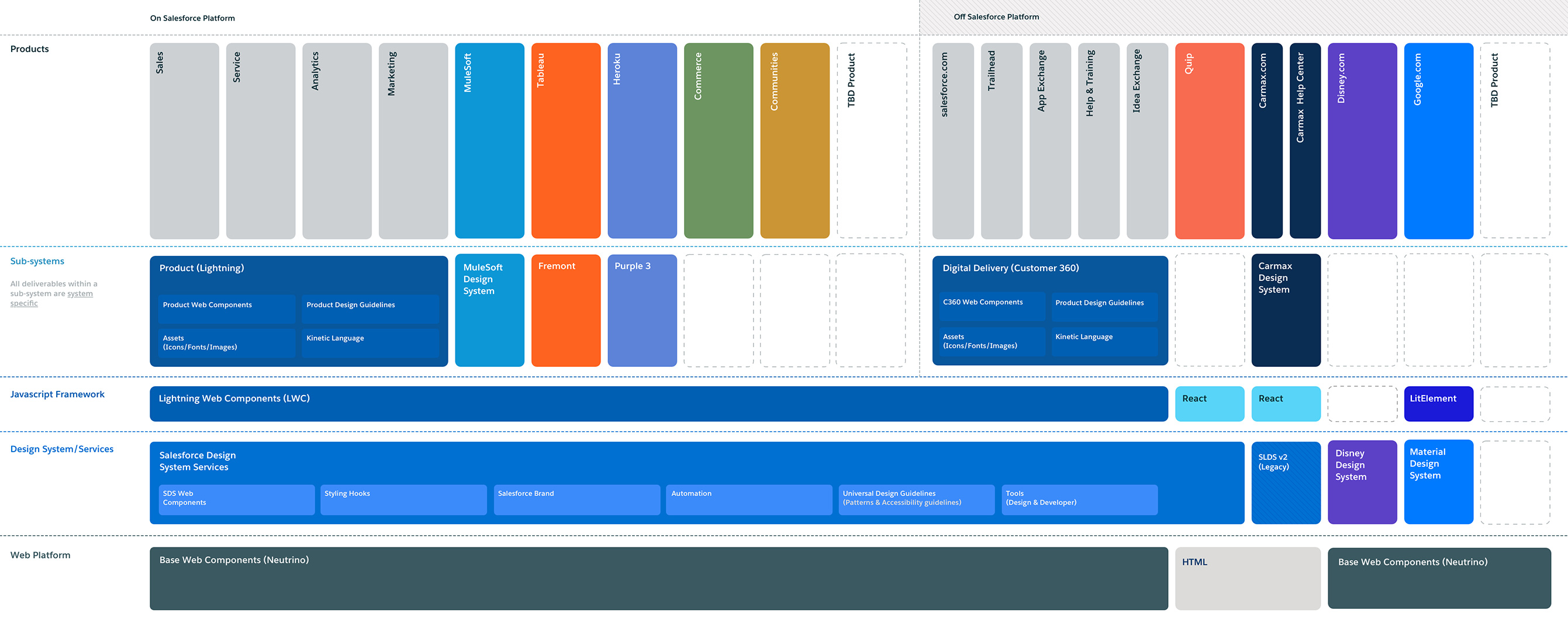
Salesforce Design System (SDS) and Sub-systems
One of SDS's driving factors was to enable business verticals to create, own, and maintain their design system, which we're going to refer to as a sub-system.
Shared Services
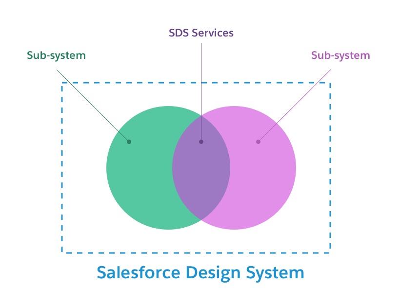
The Salesforce Design System is the low-level design system that provides the thread between all sub-systems built on SDS. The thread is achieved through SDS services that codify business decisions and universal design choices.
What is the Salesforce Design System trying to achieve?
- Mature our design language and system to become the Salesforce Design System that gives any Salesforce digital property continuity, and an experience that’s familiar, user-centered, and engaging.
- Provide an offering of services that can help business verticals maintain brand consistency.
- Enable Salesforce developers to build with standard specifications in mind:
- Web Components with native shadowDOM
- Modular and encapsulated CSS
- CSS custom properties (Styling Hooks) for supported visual customizations
- Support for named :part for advanced visual customizations
- Promote modular patterns for component composition and styling
- In-depth specifications of component anatomy that communicate intended behavior, parts, and basic functionality.
- Create centralized tools that promote adoption and consistent ergonomics.
- A dialog with our stakeholders and customers to understand the most effective ways to grow the design system to new levels of maturity and sophistication to encompass the Salesforce Experience Values.
- Inclusive and ethical values ensure that any Salesforce experience is accessible to all users. We will codify our business values into our products from the foundation up.
Some highlights of SDS today that will support full styling customizations in a native shadow DOM world are:
- A robust set of Styling Hooks (CSS custom properties) allows for holistic, targeted, and contextual customizations. We refer to these as:
- Global Styling Hooks - holistic app-wide changes, “I want my brand colors to be represented throughout the app”
- Shared Styling Hooks - targeted, “I want to change all my heading sizes”
- Component Styling Hooks - contextual, “I need to tweak this color for this single button”
- New naming pattern for styling hooks that are systemized to scale as new component needs are presented.
- A new set of color relationship Styling Hooks ensures WCAG 2.1 compliance and theming.
- New component specifications that align with native shadow DOM compliance can be utilized to understand intended behavior, parts, and basic functionality.
- Component-specific CSS is unopinionated in styling but offers the base structure along with the Styling Hooks to apply a theme easily.
A business vertical should consider a sub-system as a 1st class standalone project. This will promote proper resourcing to ensure your sub-system can stand on its own with SDS's support. By becoming a contributing partner in our centralized design system process, you are doing your part in promoting the highest quality, continuous experience that’s familiar, user-centered, and engaging.
A sub-system has a seat at the table, and we (SDS) want to encourage collaboration and engagement to make sure we're providing the proper services at the SDS layer.
To visualize the layers, you can review the following image:
This image is subject to change but is currently our north-star vision of SDS